CHI SKILLS
The greatest journey in life, is the one going inside.
SynOpsiS

WEBSITE DESIGN

BRANDING

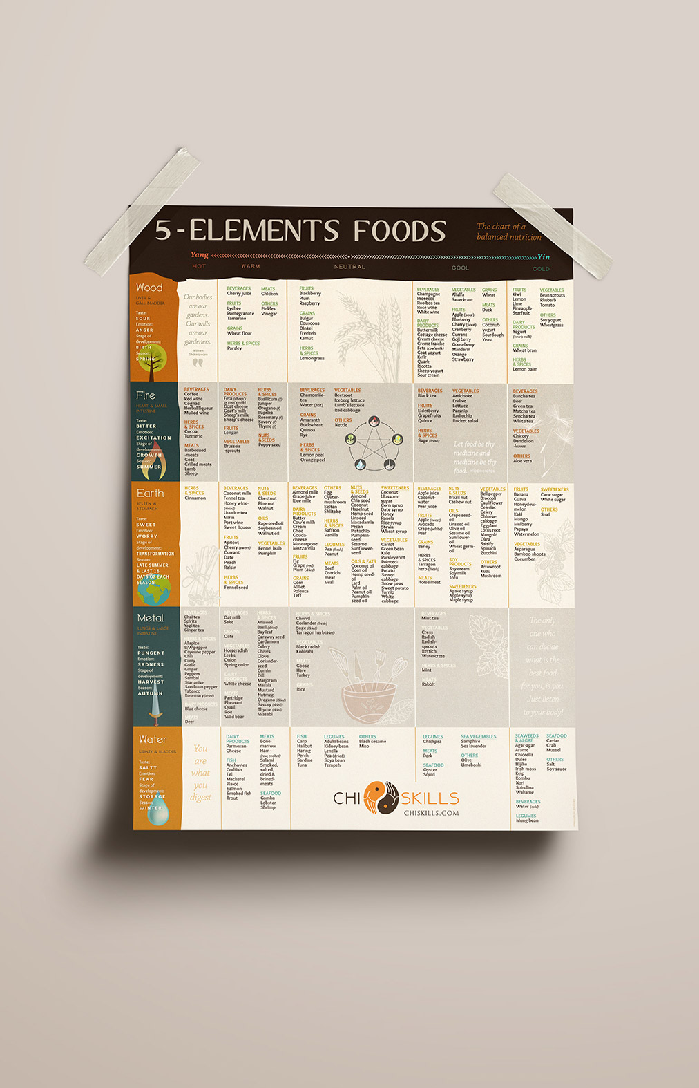
POSTER

MULTIMEDIA

CREATIVE ELEMENTS
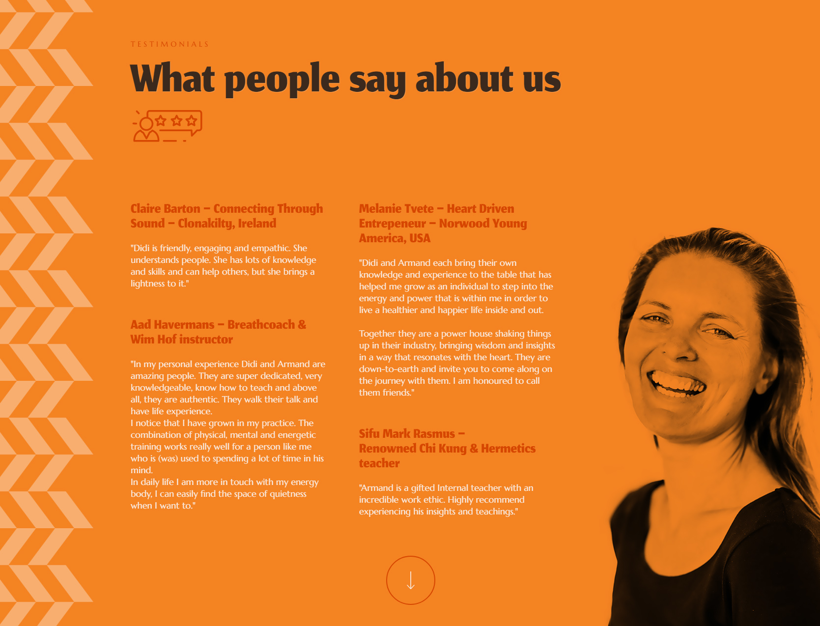
Chi Skills is an online school dedicated to teaching the internal arts through clarity, discipline, and embodied practice. I was invited to develop a complete visual and digital identity that communicates the grounded, transformative nature of their work. This project included a full website design, a refined brand identity, promotional posters, and multimedia graphics for YouTube and social platforms. The result is a cohesive visual ecosystem built around natural textures, energetic movement, and a minimal, modern aesthetic—supporting Chi Skills’ mission to help people become their own teachers.
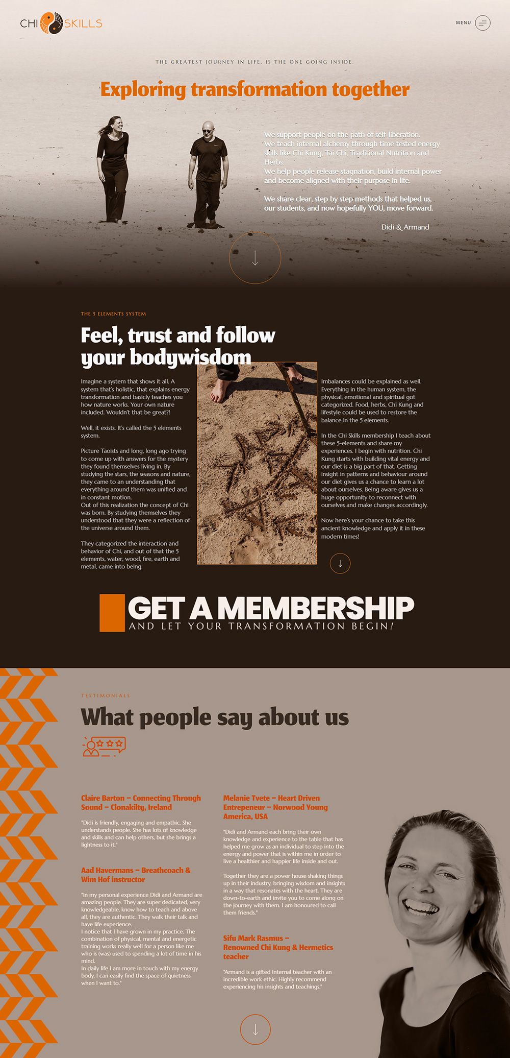

The primary objective was to design and develop a high‑impact website, refined brand identity, and supporting visual materials that express the school’s unique approach to energy work. This included a full website build, logo system, posters, and multimedia graphics for YouTube and social platforms.
- Research and Discovery:
- Studied Chi Skills’ methodology, training structure, and student journey.
- Identified the visual language that best represents their blend of science‑based clarity and energetic mastery.
- Collaborated closely with the founders to align the brand with the school’s mission and long‑term vision.
- Website Design:
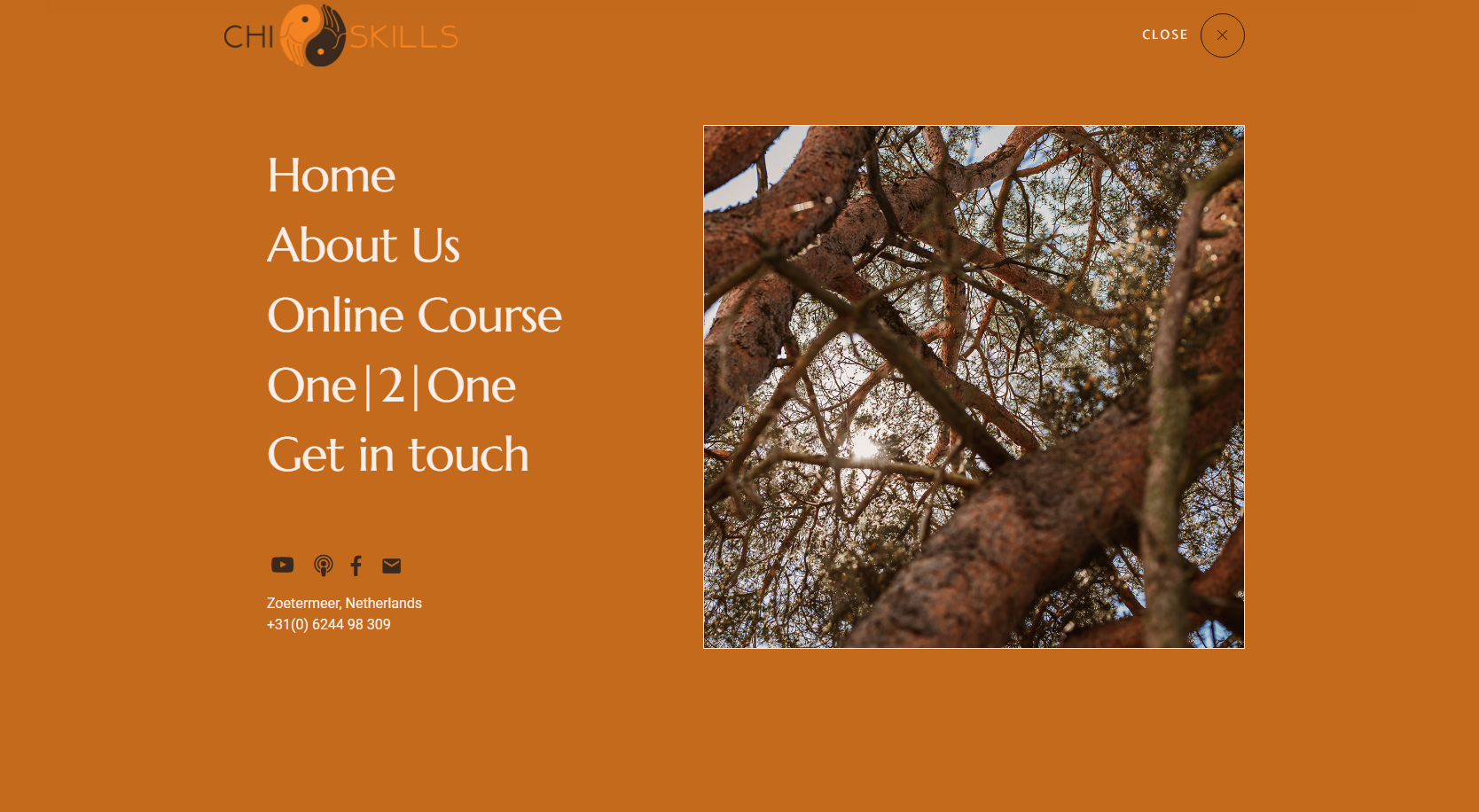
- Designed a full website experience that mirrors the Chi Skills journey: clear, spacious, and energetically focused.
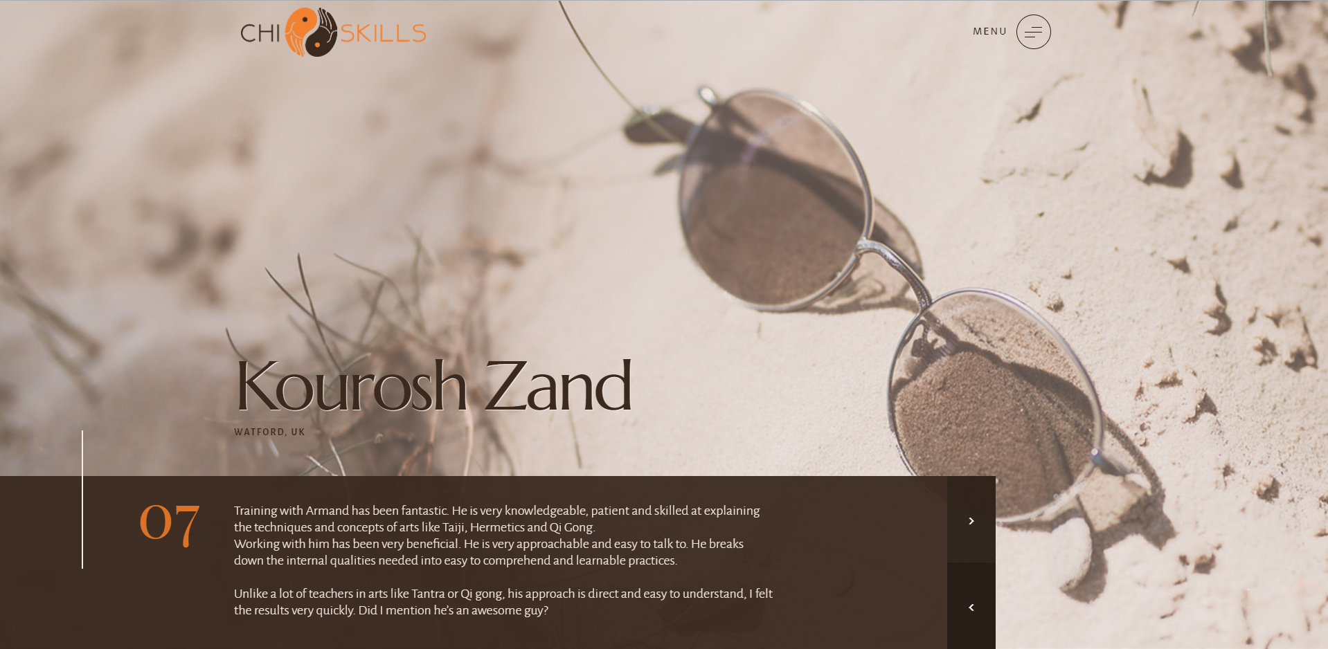
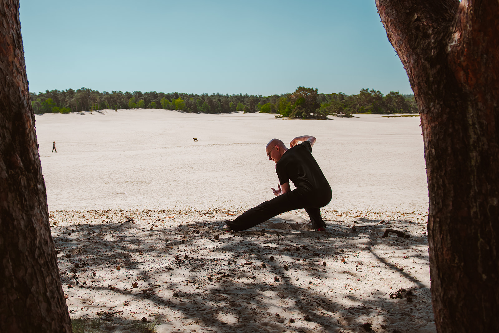
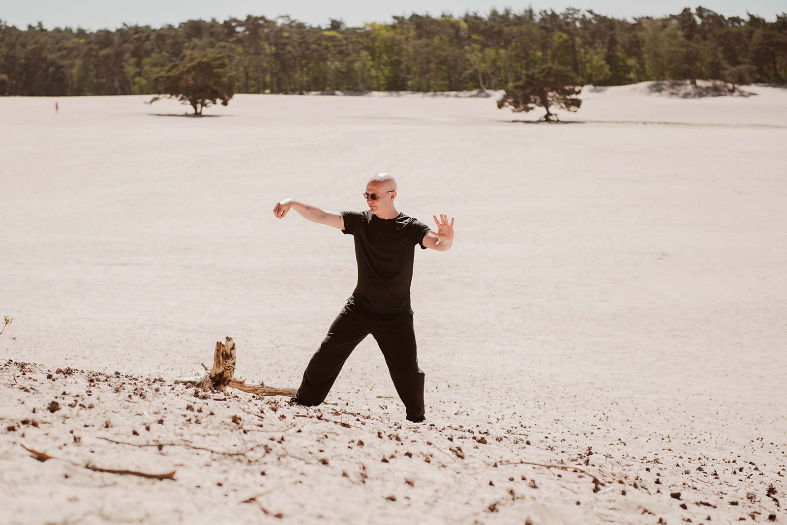
- Used earth‑based imagery (sand, mountains, natural light) to reflect the grounded nature of Chi training.
- Developed a visual system inspired by energy flow, internal power, and precision, ensuring every page feels aligned with the school’s teachings.
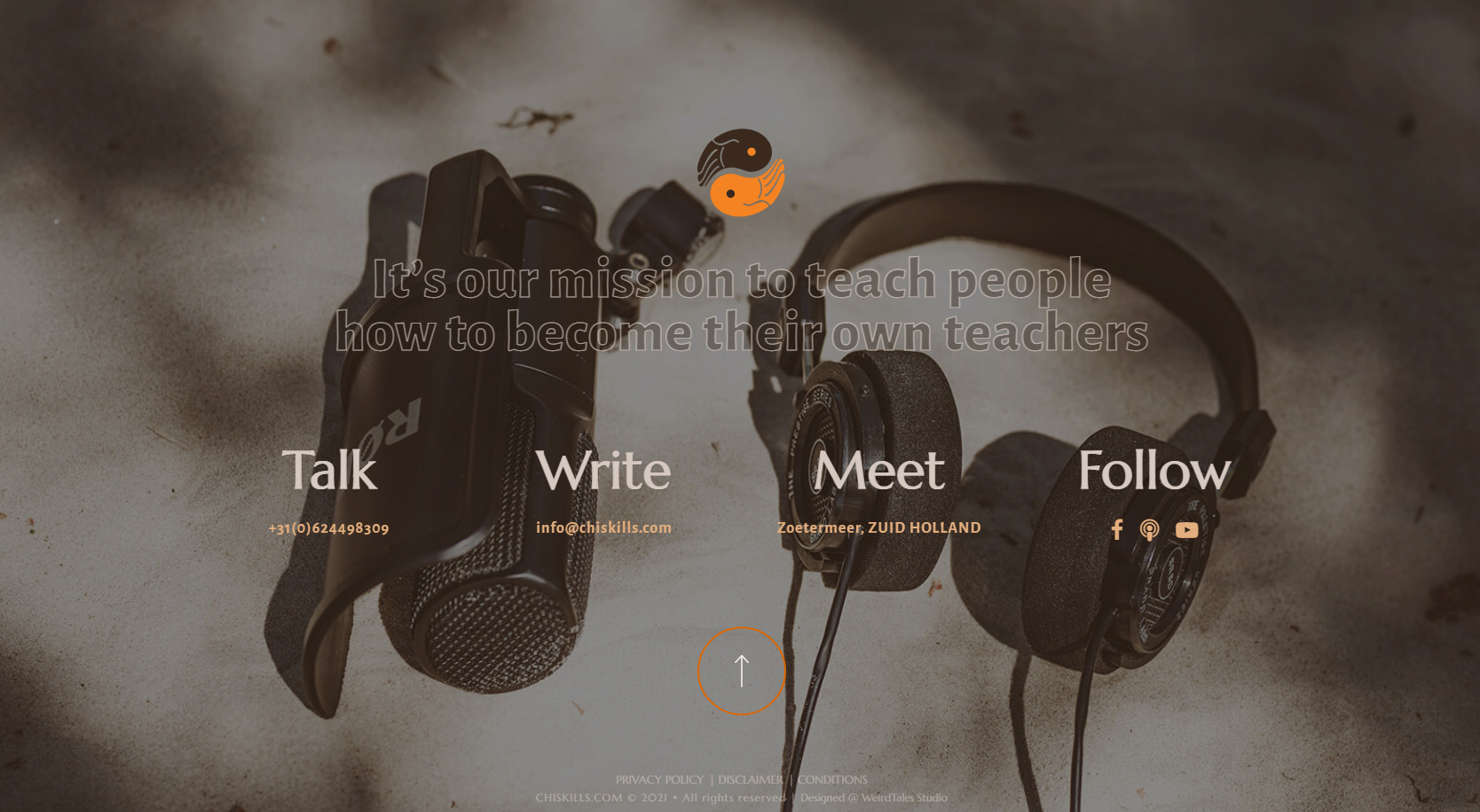
- Added multimedia‑ready sections for YouTube, podcast, and social channels to support their growing online presence.
- Integrated strong hero sections with bold typography and clean layouts to communicate authority and simplicity.
- Optimized the site for performance, readability, and SEO fundamentals.
- Brand Identity:
- Designed branded assets for social media, course materials, and community platforms.
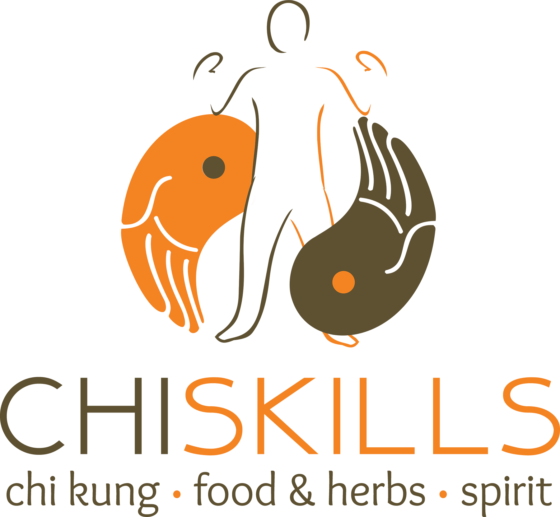
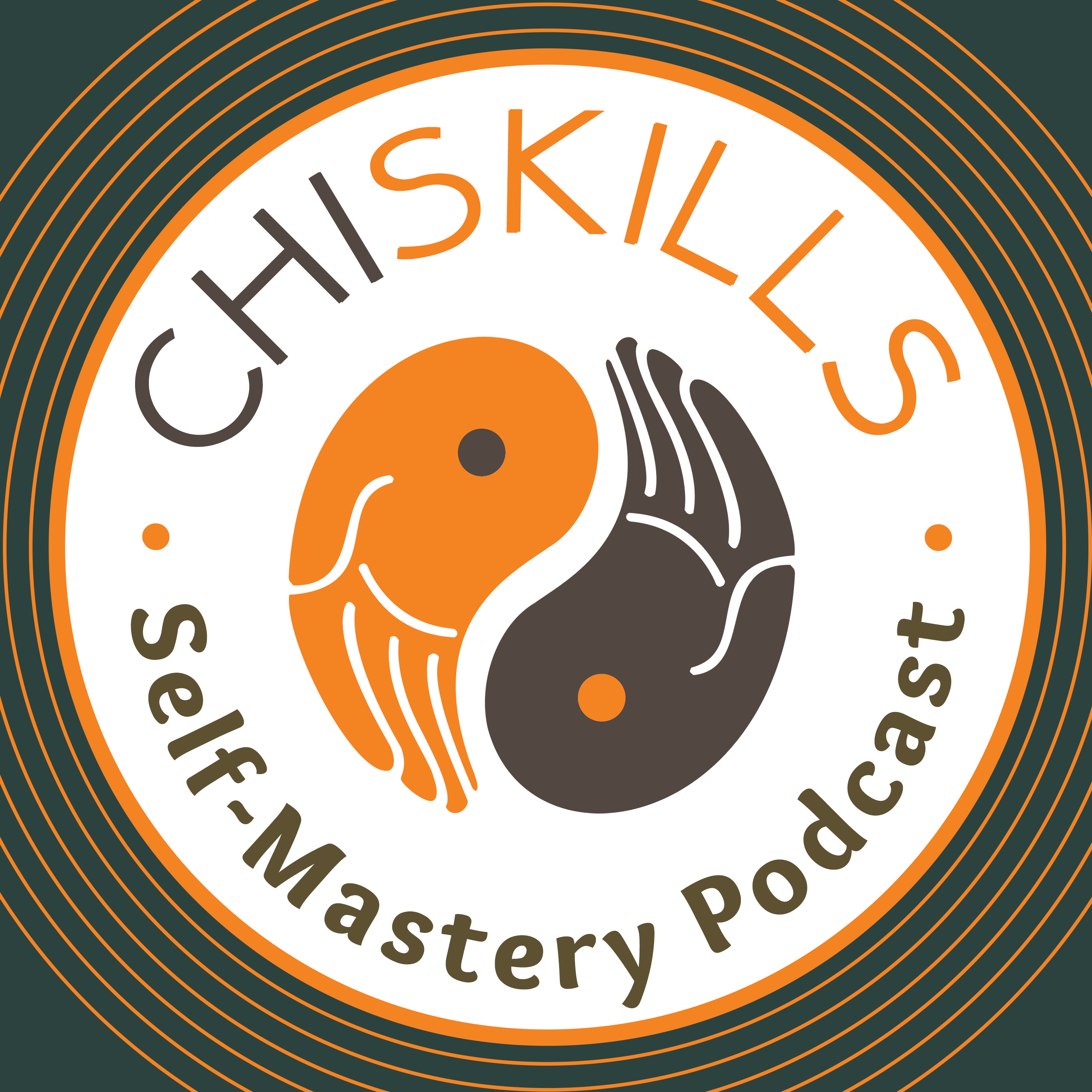
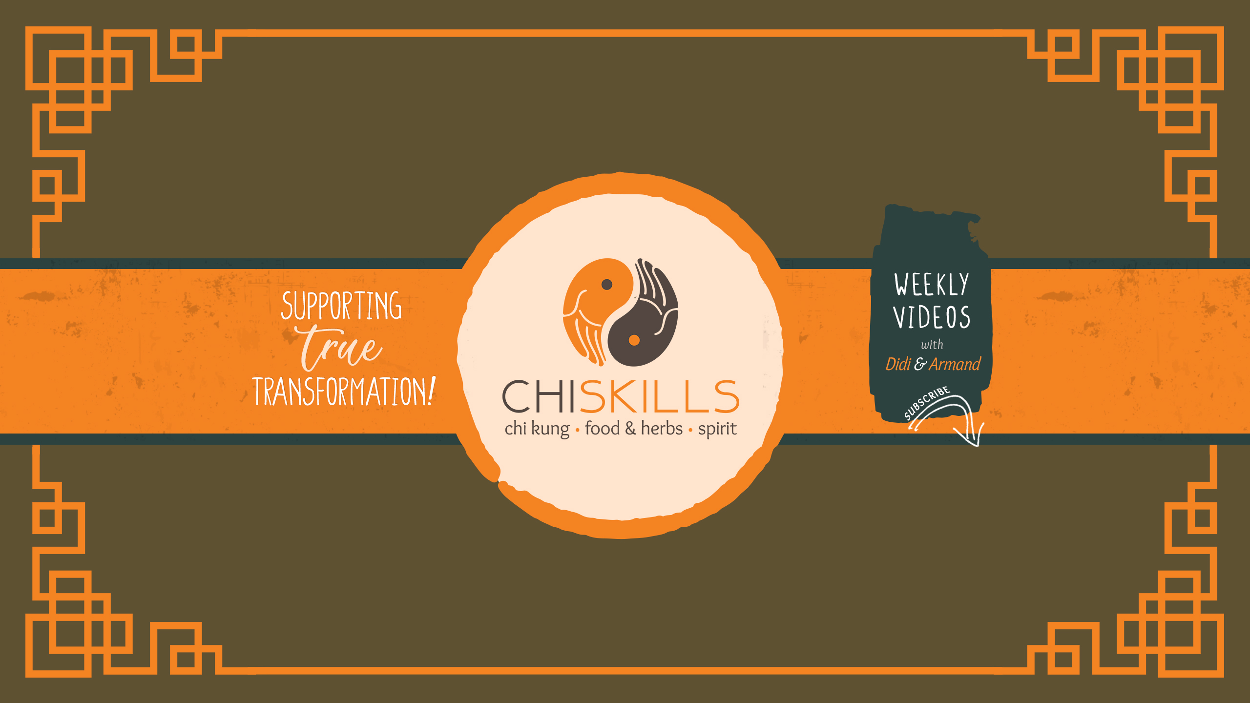
- Designed Chi Skills logo featuring the yin‑yang and hand motif, ensuring it works across digital, print, and video.
- Developed a color palette centered on warm earth tones, deep browns, and energetic orange accents.
- Created a typography system that balances strength and clarity, supporting both educational and promotional content.
- Built a consistent visual rhythm across all pages and materials, reinforcing brand recognition.
The final brand ecosystem presents Chi Skills as a grounded, trustworthy, and transformative training school. The cohesive visual identity supports their mission of teaching people to become their own teachers, while the website and graphics elevate their presence across digital and physical touchpoints.
❝
When I received my Logo from her I was stunned.
Val is a true Artist! When I received my Logo from her I was stunned.
Not only was she able to come up with a great design, she captured the essence of me, and what I want to express. And she did all of that without meeting me in person! Highly recommended!

Armand van Middendorp